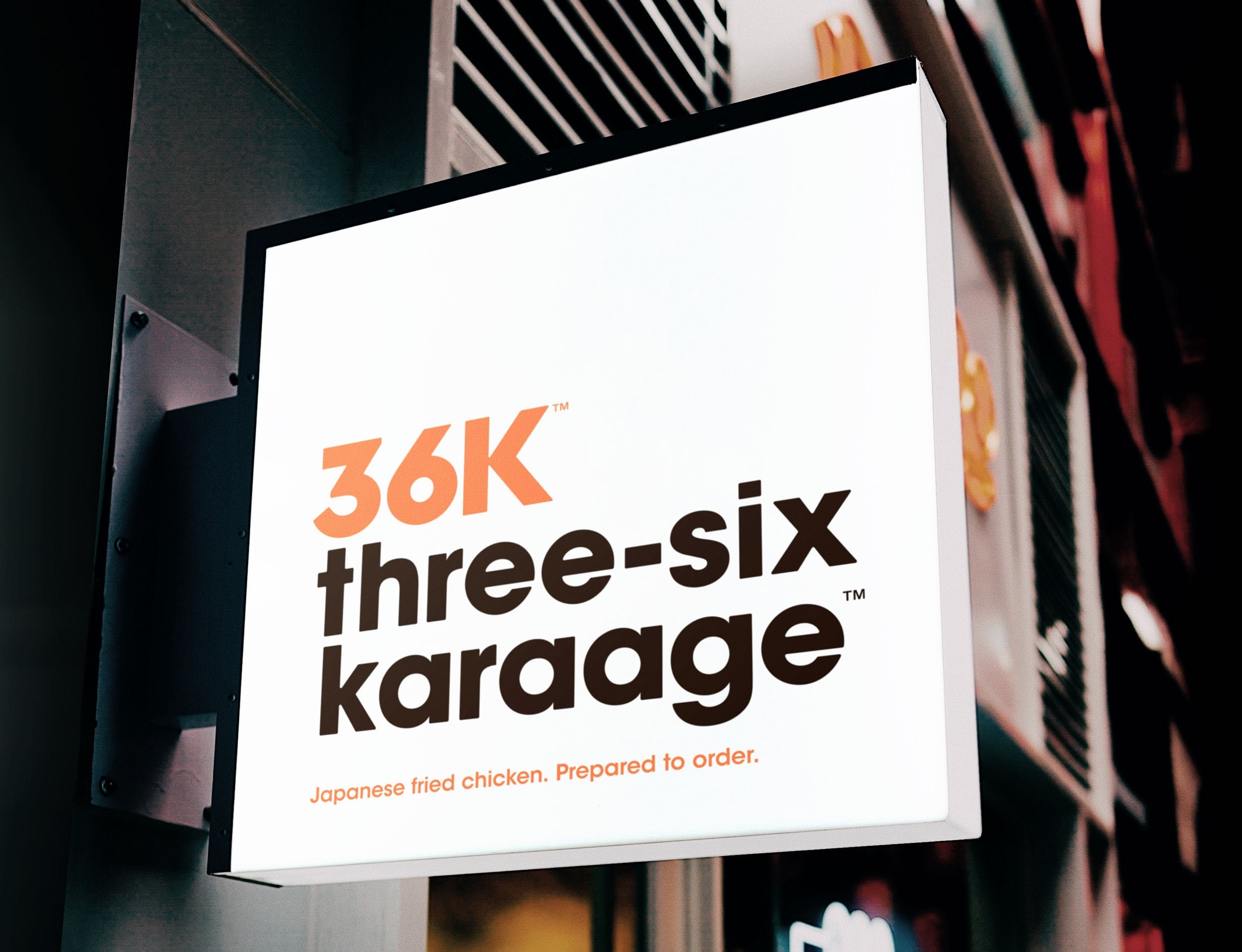
Developing a high-impact brand identity for Three-Six Karaage takeaway
Concept and ideation
Design
Branding
Materials photography
Illustration
VANCOUVER, CANADA
The concept
Three-Six Karaage (36K) is a Japanese fried chicken takeaway restaurant. Customers can choose 3- or 6-piece boxes prepared to order. This self-initiated concept is based on the colours, themes, and patterns I saw at similar takeaway restaurants when I lived in Osaka, Japan.
The goals
Create branding for a chicken takeaway spot like the ones I used to order from in Japan. I also wanted to test the design thinking process to create a highly visible brand identity for packaging, wayfinding and other applications.
One important caveat on the brand identity: no chickens mascot whatsoever.

36K brand and identity
Casual, approachable, and highly visible from a distance, with kiosks and storefronts located primarily in urban or suburban shopping areas and transit hubs. Serving customers who enjoy eating quality takeaway food and prefer a simple, focused selection of menu items.
Izakaya menu design theme
Izakaya restaurant menus are often hand-lettered with bright vermillion and black ink on white paper. The menus are a living, ever-evolving document that showcases a restaurant’s food and character. Contrasting colours and organic type hierarchy make menus easy to navigate.
I wanted to match the menus and the minimal layout of food packaging found at mid-to-upscale Japanese department stores like Kintetsu, Takashimaya, and Daimaru.
